Jetstar Mobile App Redesign to Reduce Cost to Serve

Redesigned Jetstar mobile app
Design approach
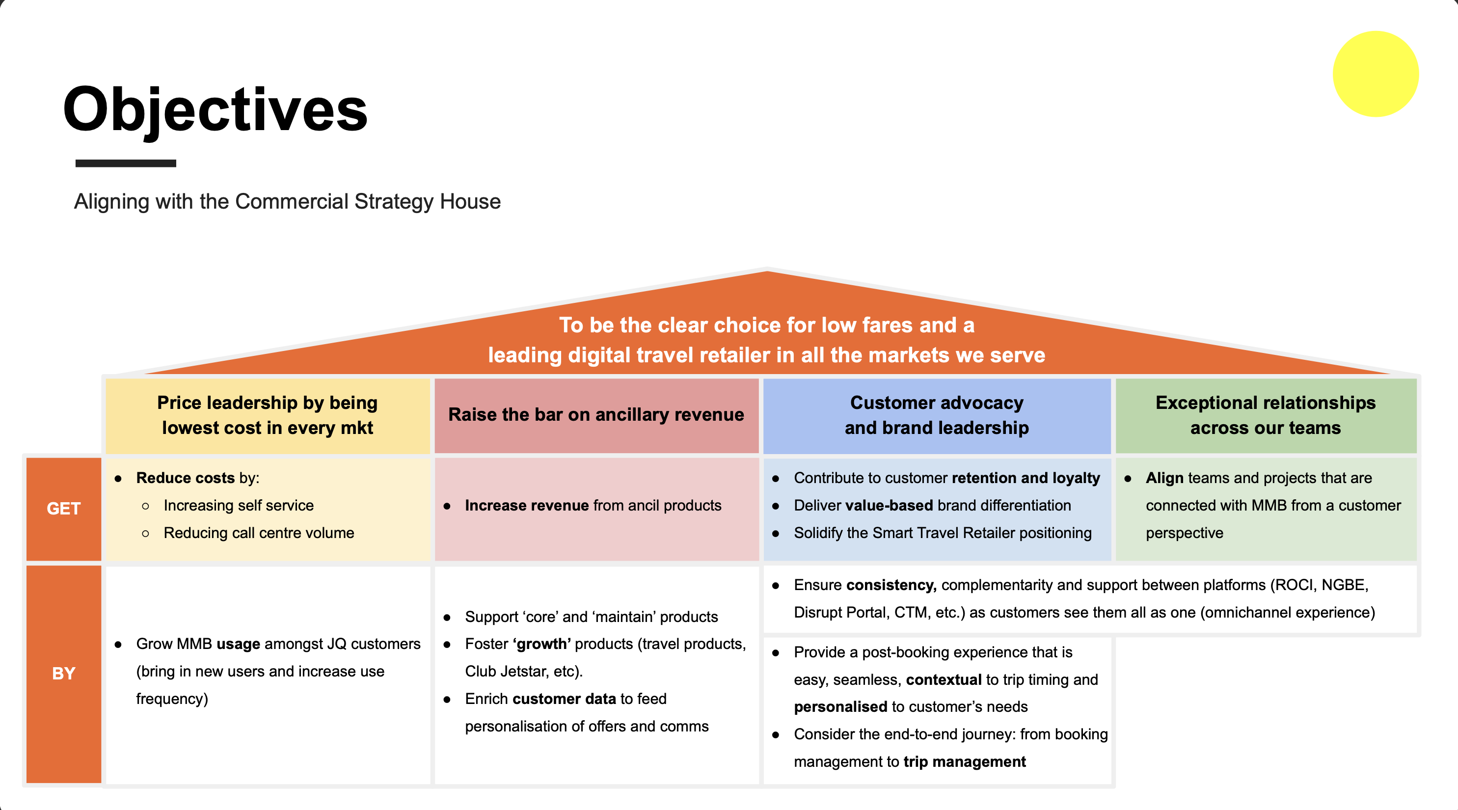
Define scope, requirements and business goals with the client
I created a story map to define scope based on a requirements document from the Business Analyst. There were over 40 epics present in the initial documentation.
The client and I decided to focus on the "Manage My Booking" theme first. It encompassed all tasks that occurred after a flight had been booked.
Previous research had recommended to focus on reducing the cost to serve for tasks like finding boarding passes and changing flights, which happened post-booking.
Desk research review to build context
To make sense of the landscape, I reviewed the existing research and mobile app. This included:
• Existing contextual inquiry and landscape review insights
• Complaints data
• Live chat data
• Stakeholder interviews with the client
Some key insights:
• A surprisingly large volume of customers use the contact centre to confirm their flights prior to travel (esp first-time flyers)
• Many customers turn up on the day of flight, unaware that they have missed a critical step prior to flight (e.g. check-in)
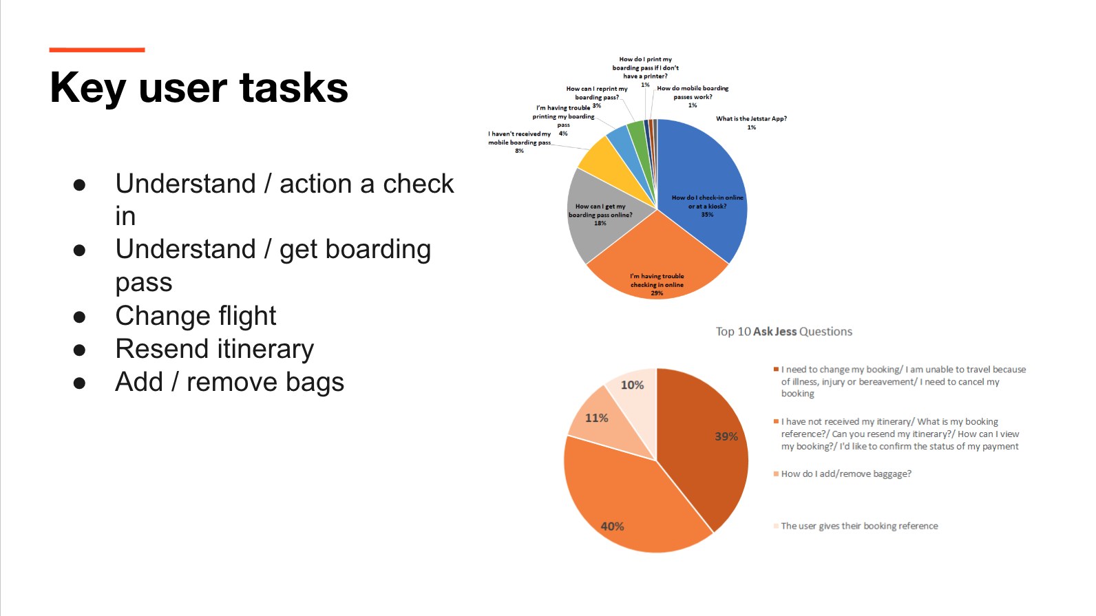
Complaints and live chat data that reveal the tasks customers struggled with the most.
This would inform changes to the information architecture and page layout hierarchy.
This would inform changes to the information architecture and page layout hierarchy.
A strategy document that highlighted the need to increase self service for Manage My Booking.
Relationship building with client
I met with the Product Owner and Business Analyst each week to discuss timelines and progress made during the sprint, to download domain knowledge and to educate them on preferred ways of working. It was time allotted to build trust.
Project management & negotiation
I took on detailed project planning so that I could orchestrate multiple activities in sequence and at speed.
We shared the high level project plan with stakeholders in weekly stand ups with 2-3 weeks of buffer built in after our first 2 epics were scheduled to finish.
We shared the high level project plan with stakeholders in weekly stand ups with 2-3 weeks of buffer built in after our first 2 epics were scheduled to finish.
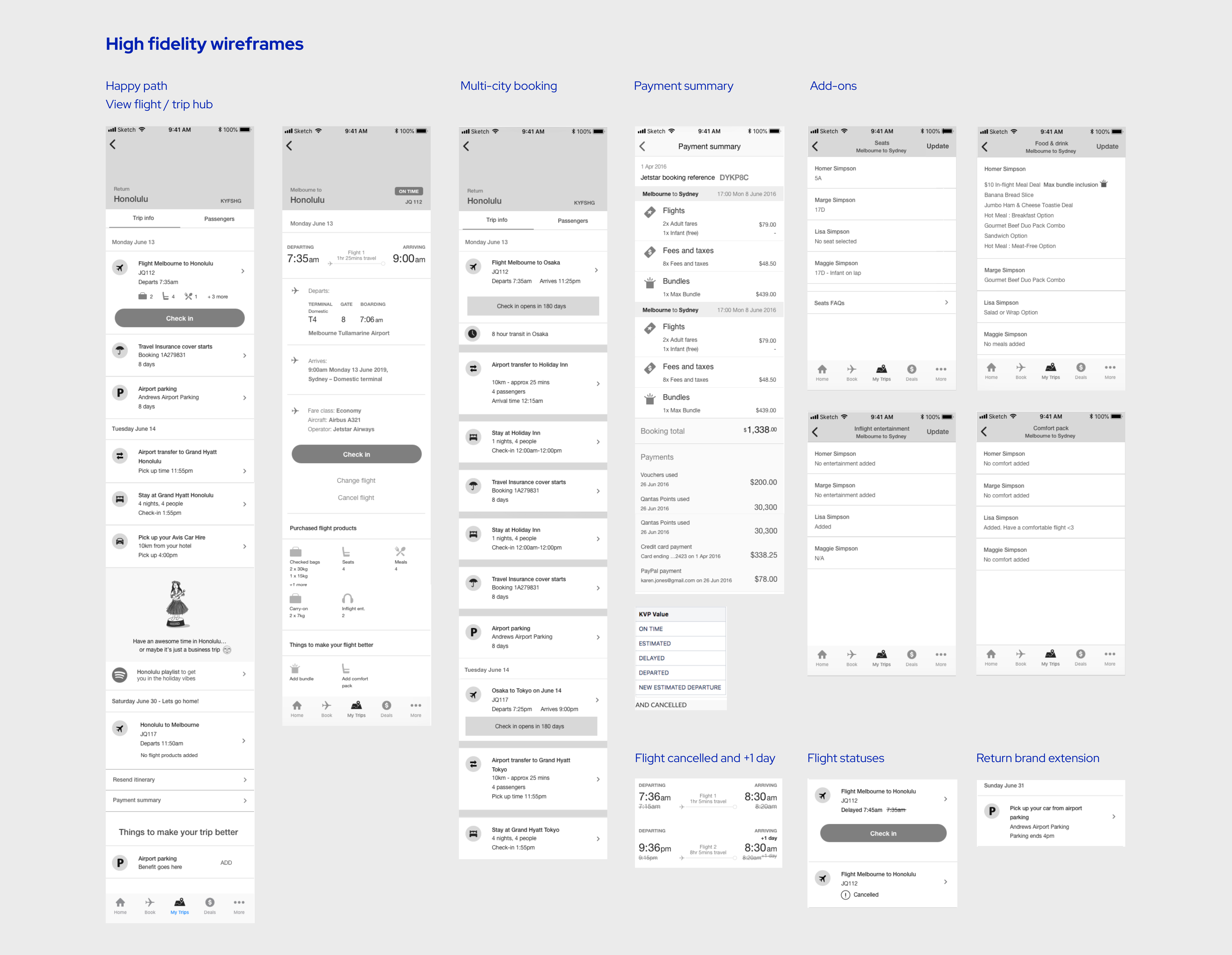
Map and wireframe a complex array of use cases
See examples below.
Some mobile app-based considerations when wireframing were:
• Apple Wallet integration for boarding passes
• Asking to use the device location when finding my gate
• Designing for ergonomics so that all primary buttons were located in the bottom half of the screens
• Push notifications for instructions for check-in and getting boarding passes.
• Apple Wallet integration for boarding passes
• Asking to use the device location when finding my gate
• Designing for ergonomics so that all primary buttons were located in the bottom half of the screens
• Push notifications for instructions for check-in and getting boarding passes.
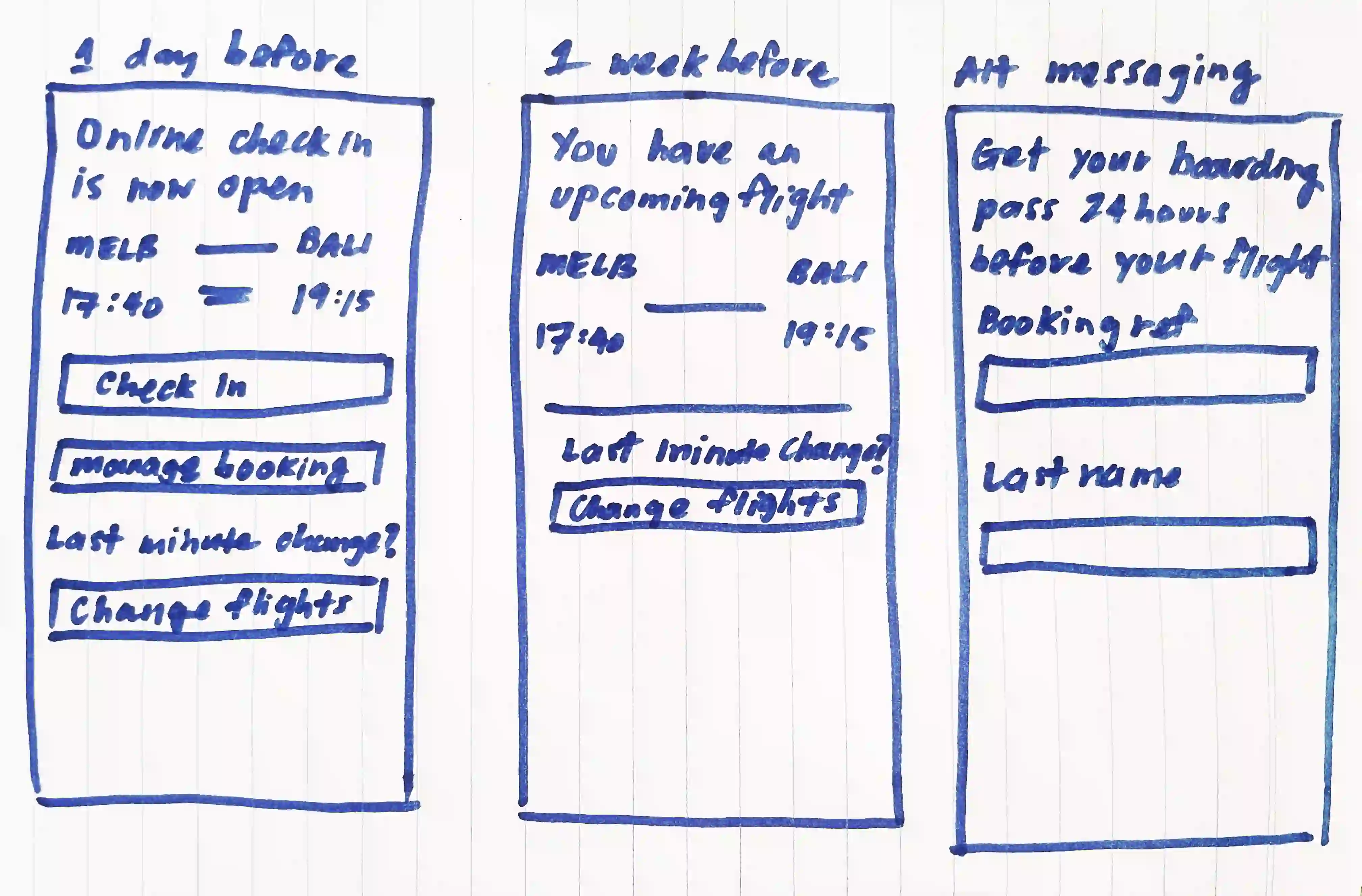
Facilitate workshop to increase traffic to Manage My Booking
I ran an ideation workshop to uncover how we'd drive more traffic to Manage My Booking and away from the contact centre.
Research indicated that it was rare for customers to login to Manage My Booking unprompted.
An email and push comms journey was a clear winner from the workshop.
Research indicated that it was rare for customers to login to Manage My Booking unprompted.
An email and push comms journey was a clear winner from the workshop.
Usability and concept testing
Previous research had suggested to concept test a “trip hub” that focussed on creating the trip as an experience rather than a flight to catch. This looked like a timeline of all related activities to the flight e.g. airport transfers, hotel bookings, meals.
We also usability tested with customers who had low tech savviness and low familiarity with managing flights.
We also usability tested with customers who had low tech savviness and low familiarity with managing flights.